The top living room paint color trends for 2026, from bold accent walls to timeless neutrals, with specific Benjamin Moore and Sherwin-Williams color picks tailored to Florida's unique light and lifestyle.
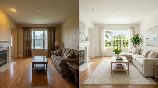
Color is the single most transformative thing you can do to a living room, and you don't need a renovation to do it. A fresh coat of paint in the right color can make a small room feel larger, a dark room feel airier, or an ordinary space feel like a carefully designed retreat. In 2026, color trends are leaning into warmth, nature-inspired tones, and bold personality, but with a sophistication that makes them livable, not loud.
For homeowners in Brevard County and across Florida's Space Coast, choosing the right living room color means accounting for something northern design guides often miss: the specific quality of Florida's natural light. This guide covers the trends, the specific paint picks from Benjamin Moore and Sherwin-Williams, and practical guidance for getting it right in a Florida home.
What Makes Florida Light Different, and Why It Matters for Color
Before you commit to any color, understand how Florida's light environment will affect it on your walls. Brevard County homes receive intense, direct sunlight for much of the year, significantly more UV exposure than homes in the Midwest or Northeast. This creates a few important color effects:
- Colors read differently by time of day. East-facing rooms receive warm, yellow-orange morning light. West-facing rooms get intense afternoon sun that can make saturated colors feel overwhelming. North-facing rooms have cool, indirect light that makes warm tones feel flat.
- Colors often look darker on your walls than on a chip. Florida's brightness creates high contrast. A color that looks like a soft sage on the chip may read as a medium green on a large wall. Go one shade lighter than your instinct when in doubt.
- Warm tones fade faster. Florida's UV intensity accelerates fading in yellows, oranges, and reds. If you love a warm terracotta, budget for repainting sooner, or invest in premium UV-resistant formulas like Benjamin Moore Aura or Sherwin-Williams Emerald.
- Humidity affects sheen selection. High humidity in coastal areas like Cocoa Beach and Melbourne Beach means matte finishes can be harder to clean. Eggshell or satin sheens perform better in Florida living rooms, they're still beautiful but more durable.
Always test paint samples on your actual wall, at least a 12"×12" patch, and view them at morning, afternoon, and evening under artificial light before committing.
2026 Living Room Color Trends
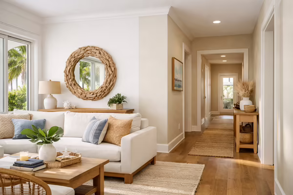
1. Warm Whites and Tonal Off-Whites
The reign of stark, cool whites is winding down. In 2026, the most popular living room whites have warm, creamy undertones, subtle enough to read as neutral but warm enough to feel welcoming and alive. In Florida's strong sunlight, these off-whites look beautiful without the clinical brightness of a pure cool white.
Top picks:
White Dove (BM OC-17)
Slightly warm with a hint of yellow-grey that prevents harshness. Works beautifully in open-plan living spaces with southern exposure.
Alabaster (SW 7008)
A soft, creamy white with warm undertones that reads as neutral in most light conditions. Sherwin-Williams' 2016 Color of the Year that remains perennially popular.
Simply White (BM OC-117)
Brighter than White Dove but still warm; excellent for north- or east-facing rooms that need more reflectivity.
Shoji White (SW 7042)
A warm greige-white with a slight yellow tone that photographs beautifully and pairs well with natural wood and rattan furnishings popular in Florida coastal interiors.
2. Earthy Terracottas and Clay Tones
Terracotta is one of 2026's biggest color stories. Orange-adjacent earth tones connect interior spaces to Florida's natural landscape, sun-baked clay, tropical foliage, warm sand. They pair beautifully with the natural materials popular in Brevard County homes: rattan, live edge wood, and natural fiber rugs. And unlike the jewel-toned terracottas of the past, today's picks are sophisticated and complex, not loud.
Top picks:
Tuscan Tan (BM HC-99)
A refined, mellow tan with terracotta depth. Works equally well in traditional CBS stucco homes and newer construction with clean lines.
Restrained Gold (SW 6129)
A warm, earthy golden-tan that reads as sophisticated caramel rather than yellow. Excellent for large, sun-flooded living rooms.
Pale Smoke (BM 2108-60)
A pinkish-tan that shifts throughout the day: neutral in bright midday light, deeply warm and cozy in the evening under incandescent lighting.
Antique White (SW 6119)
Despite the name, this is closer to a creamy terracotta than a white. Complements the warm tones of natural wood flooring common in Florida homes.
3. Coastal Blues and Complex Aquas
Living in Brevard County means living near the water, and blue is a natural choice for homes along the Indian River Lagoon, the Banana River, or the Atlantic coastline. But 2026's coastal blues have moved on from the bright, tropical shades of the past decade. The trending picks are more sophisticated: muted, dusty, complex tones with grey or green undertones that feel like a calm ocean at dusk rather than a tourist postcard.
Top picks:
Quiet Moments (BM AF-210)
A muted, complex blue-green that shifts from distinctly blue in bright light to noticeably green in shade. Among the most versatile coastal colors available.
Rainwashed (SW 6211)
A soft, complex aqua-grey that reads serene and sophisticated. One of Sherwin-Williams' most requested colors for coastal Florida living rooms.
Woodlawn Blue (BM HC-147)
A timeless, soft blue with grey undertones that photographs beautifully and complements white trim and natural wood floors.
Watery (SW 6478)
A bright, airy aqua that feels refreshing without being intense. Best in rooms with north or east exposure where it won't become overpowering.
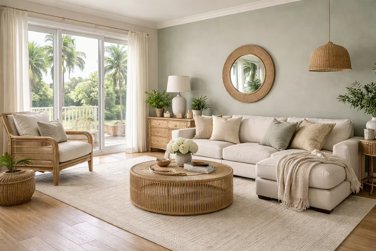
4. Sophisticated Greens — The Biophilic Wave
Green is everywhere in 2026, but the greens that are trending are nothing like the avocado or hunter greens of decades past. Today's greens are complex, nuanced shades with grey, brown, or blue undertones. The biophilic design movement has pushed sophisticated greens into living rooms across the country, and they're especially resonant in Florida's lush, tropical environment.
Top picks:
October Mist (BM 1495)
Benjamin Moore's 2021 Color of the Year and still going strong. A subtle, complex sage green with grey undertones that functions almost as a neutral.
Evergreen Fog (SW 9130)
A muted, complex green-grey that works as a sophisticated neutral. Sherwin-Williams' 2022 Color of the Year.
Pale Vista (BM 868)
Light, airy green that feels refreshing and almost spa-like. Perfect for Florida living rooms that open onto a lanai or pool area.
Sage (SW 2860)
A warmer, golden-tinted sage that reads as organic and inviting. Works particularly well with terracotta accents and natural wood tones.
5. Deep, Dramatic Tones for Accent Walls
Not every wall needs to be light and airy. A single dark accent wall, behind a sofa, fireplace, TV console, or built-in shelving, creates dramatic depth and makes lighter furnishings pop. The trick in Florida homes is controlling how much direct sunlight hits a dark accent wall; intense direct sun on a dark color can feel oppressive, while the same color in indirect light creates a rich, enveloping depth.
Top accent wall picks for 2026:
Black Forest Green (BM 2047-10)
Deep, lush forest green with a slight blue undertone. Pairs beautifully with warm wood tones, brass fixtures, and cream upholstery.
Naval (SW 6244)
A rich, dark navy that reads like a bold statement without being overwhelming on a single wall. One of Sherwin-Williams' most acclaimed deep colors.
Newburyport Blue (BM HC-155)
A sophisticated dark blue-grey that's slightly lighter than true navy, making it easier to live with long-term while still commanding attention.
Urbane Bronze (SW 7048)
Sherwin-Williams' 2021 Color of the Year: a warm, complex brown-grey that reads as earthen and sophisticated. Excellent for south or west-facing accent walls.
How to Choose Based on Room Size and Natural Light
Small Living Rooms
In smaller spaces, light colors appear to expand the walls, but "light" doesn't mean boring. Choose warm off-whites (White Dove, Alabaster) or soft, barely-there tones of blue, green, or blush. Avoid stark contrasts between walls and ceiling, painting ceiling and walls the same color or a lighter tint of the wall color makes the ceiling feel higher. Keep trim white or very slightly lighter than the walls to avoid chopping the room into visual segments.
Large, Open-Plan Living Spaces
Florida's open-plan living rooms, kitchen, dining, and living flowing together, can handle more saturated color than a small enclosed room. Earthy terracottas and sophisticated greens work beautifully in large spaces. The key is choosing one color throughout the open plan (rather than different colors in each zone) to create visual flow and cohesion.
Dark or North-Facing Rooms
If your living room receives limited natural light, common in north-facing rooms in CBS homes with deep overhangs, avoid cool colors (cool greys, cool blues) that will accentuate the darkness. Choose warm undertones: warm whites, warm greiges, warm taupes, or earthy tones that reflect light warmly rather than absorbing it.
Choosing Colors That Work With Your Existing Furniture
The best living room color complements what's already in the room, your sofa fabric, wood tones, flooring, and tile. Here are quick pairing guides:
- With grey or charcoal sofas: Blues (Woodlawn Blue, Naval), soft greens (October Mist), warm whites (White Dove)
- With beige or tan sofas: Warm greens (Pale Vista, Sage), terracottas (Tuscan Tan), warm whites (Simply White)
- With dark wood furniture: Warm whites (Alabaster), earthy taupes, warm greens (October Mist), navy accent walls
- With white or cream sofas: Almost any color works; this is where bold accent walls and saturated colors shine most
- With coastal/rattan furniture (popular in Florida): Blues (Rainwashed, Quiet Moments), warm aquas (Watery), warm whites (Shoji White)
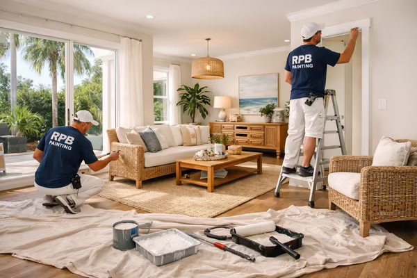
RPB Painting's Color Consultation Service
Choosing colors from a chip or a screen is genuinely hard, paint can look completely different on your actual walls under your specific lighting conditions. RPB Painting LLC offers complimentary color consultation as part of every estimate. Bring your inspiration images, tell us about your lighting conditions and existing furnishings, and we'll help you narrow down options that will look extraordinary in your specific space.
If you're ready to transform your living room with a fresh coat of color, explore our interior painting services, or if you're considering a more decorative treatment like a faux finish or textured accent wall, learn about our custom painting and faux finish options. Contact us today for a free estimate and a conversation about what color can do for your home.